- It makes UI components reusable in different contexts, for example in sub-panes of editors, or in dialogs or wizards.
- It enables implementations in other languages. Presently, JavaScript is supported.
Rather than depending on "hub" interfaces like IWorkbench, UI components express dependencies on individual services. Examples of services are error logging, preference store, and styling engine. This set can be extended by application developers.
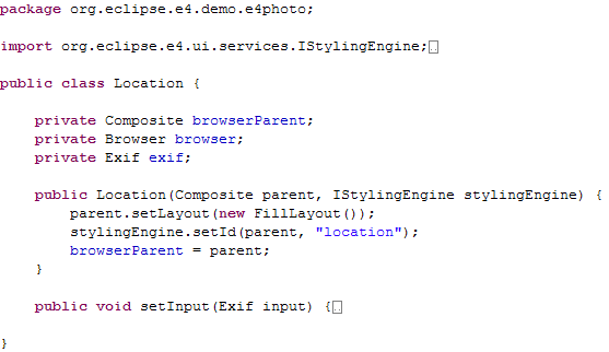
Dependency injection is used to supply these services, along with other required objects, to the constructor of the client object. For example, in the snippet below, the parent composite and the styling engine are both thus supplied.
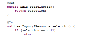
@Inject and @Resource. At this point we
recommend using @In for values and services that should be injected,
@Out for bean properties that should be observed by the context, and
@PostConstruct for methods that should be called after constructing an instance
and injecting all values and services. There are no code dependencies on existing dependency
injection frameworks. These annotations are defined in the org.eclipse.e4.core.services.annotations bundle.
For an example, see ExifTable.java in the e4 photo demo application.
- Context hierarchies. Contexts can be nested within a parent context to override services provided by their parent. This enables application code written in one context to be easily transferred to work in different contexts.
- OSGi service lookup. Contexts can be used to obtain references to OSGi services. The context takes care of tracking dynamic service changes and cleaning up unused services when contexts are discarded.
- Dependency injection. Values from a context can be injected into an application object. This results in injectable fields and methods in the application object being provided with values defined in the context. Injection completely removes direct dependency from application code onto the framework.
- Storage of functions. Contexts can store functions that are evaluated lazily to obtain context values. A client retrieving values from a context may be obtaining raw values stored in the context, or the result of some function that was evaluated at the time of the context lookup.
- Traditional change notification, and registration of data-binding style update code with a context. Each time the registered update code is run, the context tracks which context values were referenced. Subsequent changes to any of those values will result in the update code re-running. Updates and events are batched and queued to avoid superfluous notifications.
- Pluggable context lookup strategies. When a context cannot find a defined value for a given name, it will consult its ILookupStrategy to determine a value. This allows integration of external service lookup systems with e4 contexts, such as the OSGi service registry.
In the context of e4, we're exploring a similar programming model and try to build on its strengths, while avoiding its weaknesses. The GUI is represented as a model instance, in the same way a web page is an instance of the HTML schema. However, instead of using XML for the model, we use the Eclipse Modeling Framework (EMF) and its Ecore language. EMF provides a clean set of concepts and simple, generic tools for modeling, and is a lot simpler than XML.
The Toolkit Model (TM) currently supports most simple widgets and containers, while complex widgets like trees and tables are in the works. TM is designed to be extended with custom widgets, that are either implemented in Java or composed by existing ones.
JavaScript is used for reacting to user generated events and updating the GUI in response. However, since EMF and the JavaScript engine are Java-based, we can easily use Java instead. If EMF is used for modeling the application data, JavaScript may also be used for implementing the application logic, making it perfect for rapid prototyping.
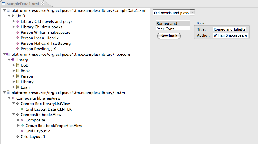
When EMF is used for modeling application data, a complete, functional application may be created by combining a scripted GUI with sample application data, as shown below.
- Injection of services in views, making view implementations much simpler
- Alternate workbench layout using a customized e4 workbench model.
- Custom view presentation using CSS
- Customizing the look and feel using CSS
- Product branding
- Data binding
It is possible to run the various e4 examples as web applications using RAP. RAP currently provides an experimental branch that contains enhancements to make it easier to run your applications on both the web and desktop with minimal changes.
As the Platform itself concentrates on being more multi-user friendly, it will be even easier for application developers to single source their e4-based applications across the desktop and web in the future.
To try it out, just follow the e4/RAP integration tutorial.
@In and
@Out annotations.
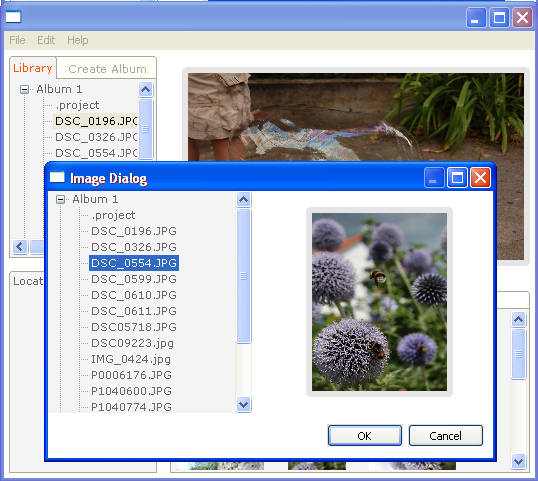
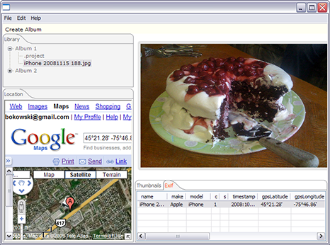
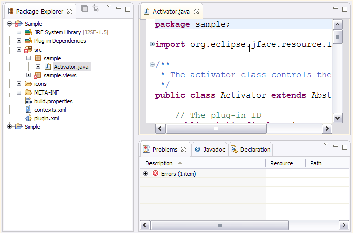
The above screen shot from the e4 photo demo illustrates a dialog containing two views that are also available as traditional views in a workbench window.
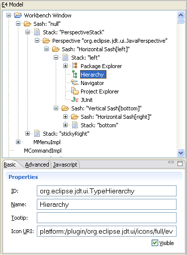
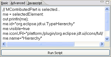
The model viewer also includes a JavaScript tab where you can execute scripts against the selected model element, much like you would run snippets in the Java debugger.
There are several examples showing the capabilities of CSS-based styling. To get a feel for what can be done, there is a handy live editor with a set of SWT controls, and a stylesheet that can be edited. Changes in the stylesheet are immediately reflected in the widgets in the editor. Similarly, one can audition styling of the Gallery widget in its example editor.

CSS support can be used separate from the rest of e4. The RCP mail application example demonstrates this, showing that one can style many aspects of an existing Eclipse 3.5 based RCP application. The example has as its base the same one generated as a plug-in example in the Eclipse SDK, with CSS support added to change fonts, background colors, and tab colors.

There is an optional new tabbed folder look (classes ETabFolder and ETabItem). This is a prototype and under construction. The modeled UI now creates it by default in the StackModelFactory, however you will get the CTabFolder look by default. To get the new look, specify in your CSS:
ETabFolder {

   webbyStyle: true;

}
For example, to specify a white to mid gray linear gradient on the selected tab of the CTabFolder, you can write:
CTabFolder:selected {

   background-color: rgb(255, 255, 255) rgb(240, 240, 240);

}
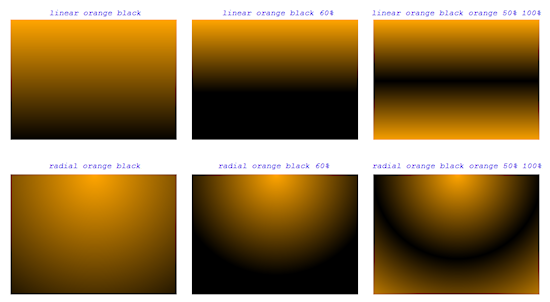
Here are some examples of both linear and radial gradients:
There is now experimental support available for specifying margin sizes. They can be specified independently on all four sides of a widget. However, they require the creation of a dedicated composite and layout. As such, in the modeled UI, only the StackModelFactory supports margins.
The CSS markup is the standard CSS you'd use in HTML, with values in pixels. So for example:
CTabFolder {

   margin: 5px; /* 5 pixels all around */

}


CTabFolder {

   margin: 5 10 15 20;  /* 5 top, 10 right, 15 bottom, 20 left */

}
Most CTabFolder setter methods now have an equivalent in CSS. For example you can say:
CTabFolder {

   color: black;

   background-color: rgb(246, 246, 251);

   font: normal;

   simple: true;

   maximize-visible: true;

   	minimize-visible: true;

   tab-height: 20px;

}
The SWT CTabFolder only maintains two color states, one for the selected tab and one for the other tabs. However, the observant Eclipse user will notice that there's also the notion of the active stack, being the last one which had focus. For example, if the Packages views is selected but I'm working in the Foo.java editor, both are selected, but only the latter is active.
In order to style these differently, the modeled UI sets the CSS classname on the widget to ".active". This is done via the IStylingEngine service. The matching CSS then determines how to style the tabs, and all four states can be represented as:
		CTabFolder {

  	color: black;

  	background-color: rgb(241, 240, 245);

  	font: normal;

  	simple: true;

}


CTabFolder:selected {

  	background-color: rgb(255, 255, 255) rgb(246, 245, 250);

}


CTabFolder.active {

  	background-color: rgb(241, 240, 245);

}


CTabFolder.active:selected {

  	background-color: rgb(255, 255, 255) rgb(255, 247, 229);

}
You can now use CTabItem as a selector within your CSS. Currently supported properties are fonts and show-close, and the pseudo selector :selected. This allows you write expressions like "all editors show their close boxes but only selected views show theirs" as follows:
CTabFolder.editors CTabItem {

   show-close: true;

}

CTabFolder.views CTabItem {

   show-close: false;

}

CTabFolder.views CTabItem:selected {

   show-close: true;

}
Additionally, one can imagine expressions like the following which would implement a common UI feedback mechanism in Eclipse, in a first class way. This in particular shows the power of separating semantics (captured in the model) from look (captured in CSS):
CTabItem.modified {

   font-weight: bold;

}

CTabItem.busy {

   font-style: italic;

}
Buttons and labels can have their alignment (alignment:) set from within CSS. All the standard SWT alignment keywords can be used (e.g. "left", "right", etc.)
To find out which CSS property keys and values you can use for a given widget class, please consult the following table on the wiki
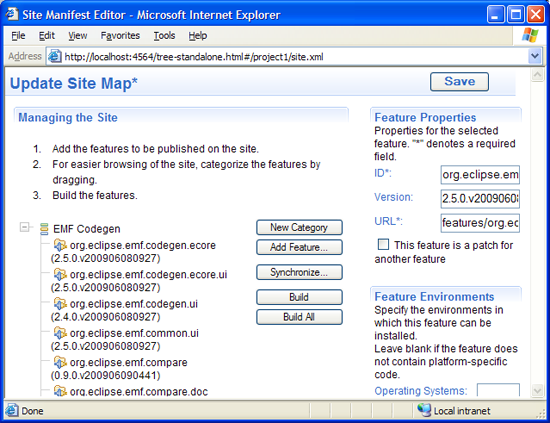
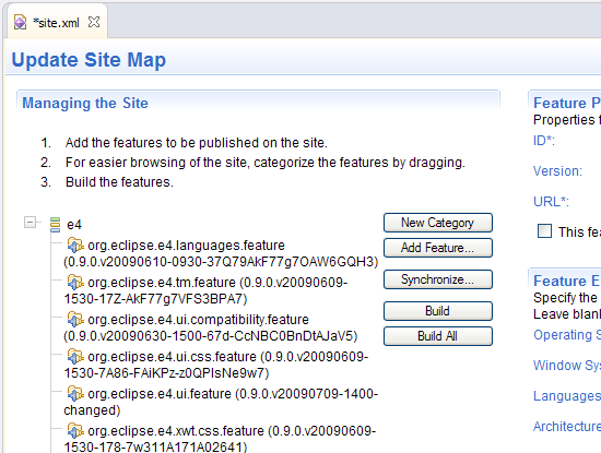
To open a site.xml file with the web-based editor, use Open With from the file's context menu.
Note: On Mac OS X, the embedded web UI does not currently work. As a workaround, add "-Dorg.eclipse.equinox.http.jetty.http.port=8080" to the end of the eclipse.ini file.
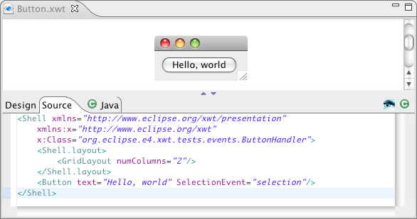
The XWT declarative widget framework is part of the e4 0.9 release. XWT allows you to specify UI components declaratively, thus separating the design and structure of your UI from specific implementation details. Repetitive boilerplate SWT code is generated automatically from the xml-based UI declaration, thus reducing development cost, improving UI consistency, and opening the door to skinning or otherwise customized rendering of an application.
XWT supports all standard SWT layouts such as FillLayout, FormLayout, GridLayout, RowLayout, StackLayout. It also handles all SWT events and an additional loaded event. The loaded event occurs when the resource file is loaded, and is used by the control class for the purpose of initialization. A convenience method InitializeComponent can be used in your control class for the same purpose.
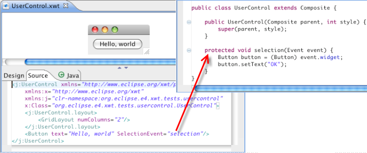
The association between UI widgets and your control class is setup automatically during UI loading. In the following example, the event SelectionEvent is handled by the method selection of ButtonHandler.
Here is the class implementing the event handler.
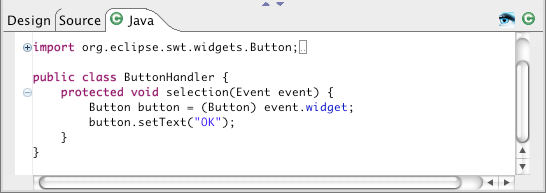
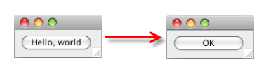
In this example, when the button is clicked the content is changed to "OK".
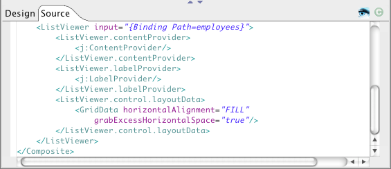
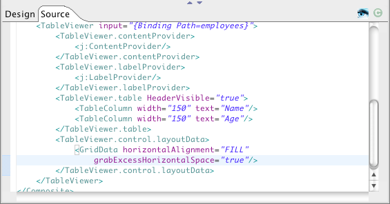
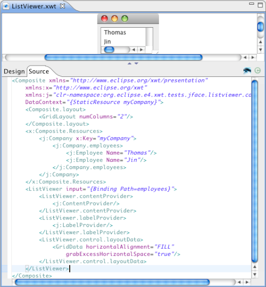
XWT supports JFace ListViewer and TableViewer. The following Viewer binds to a Company object. The "input" data must be an array or a collection.
Here is an example using ListViewer.
Below is a TableViewer example with the definition of two table columns.
XWT supports directly integrating user-defined SWT widgets in your declarative UI. In the following example, a customized UserControl widget contains a button that responds to a selection event.
Now we can integrate the custom control directly into a new XWT component:
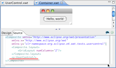
Here is the result:
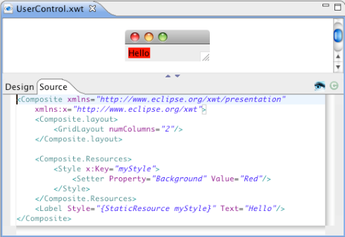
All controls in XWT can have an additional style property. This property specifies a style object that defines widget properties such as fonts, colors and images.
In the following example, we define a style with a background color of red, and apply it to a label control:
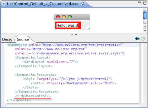
You can also define a style for a specific widget type. It is applied to all UI elements of this type under a given UI tree structure.
In the following example, the MyUserControl component consists of a Label with text "Hello, world". We embed it into a customized component and declare a style to be applied to components of that type.
In addition to embedded XML-based style, XWT provides a customizable styling mechanism. Styling can be applied at several levels:
- Application
- Resource view
- UI element
Integration with e4 CSS is already provided as one of the standard styling solutions.
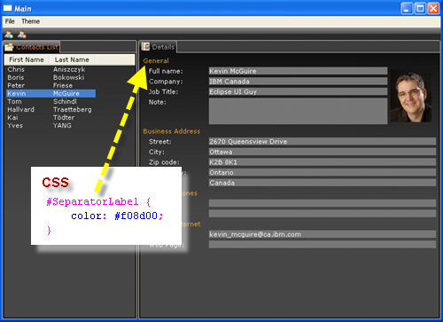
Here is the code in the e4 contacts demo that integrates CSS styling with XWT:
  <Composite xmlns="http://www.eclipse.org/xwt/presentation"
     xmlns:x="http://www.eclipse.org/xwt"
     xmlns:css="http://www.eclipse.org/css"
     x:Class="org.eclipse.e4.demo.contacts.views.DetailsView">

   <Label text="{x:Static c:Messages.General}" css:id="SeparatorLabel" />
   ...

  </Composite>
XWT directly supports JFace data bindings. Each node in the XWT tree structure has a data context. If a node does not have a data context specification, it inherits the data context of its parent. The data binding expression relies on the data context of a node in the UI tree.
In the example below, a JFace list viewer is bound to the set of employees in a Company object.
The presentation of data through references can be expressed in a path expression.
The following example shows the city of the manager of a company, which is the data context of window. The path is specified as "manager.address.city".
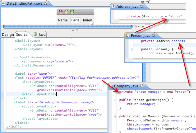
Data binding requires a consistent configuration between the data model, binding expression and UI structure. In real world applications, this relationship quickly becomes complex and trouble-shooting can be onerous without tooling support. XWT supports an option to print out the UI element tree structure with the associated data context and data binding expression. This option facilitates identification and resolution of data binding bugs.
Take the example above, add an event button. Run the project.
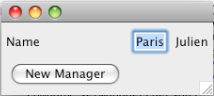
Click the button. The log is displayed in the Console.
A command is behavior associated with a widget selection event. It is defined on Button and MenuItem, for example the action "Open" or "Close" to open or close a window. Commands must be registered programmatically with the framework:
XWT.registerCommand("<command name>", aCommand)
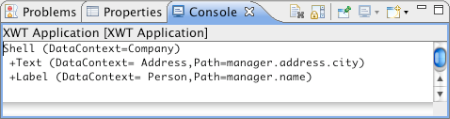
XWT includes simple internationalization support in the current release.
In the example below, the content of the button is specified by the "title" value of a messages.properties file.
XWT introduces a new concept to handle some different types of data than plain old Java objects (POJOs). This concept relies on the classes IDataProvider, IBindingContext and IDataBinding. Each data type should implement these three types to integrate their data model with XWT's data binding engine. The Java Bean data binding is mainly handled by the class ObjectDataProvider.
A new plugin "org.eclipse.e4.xwt.xml" has been added to implement the XML data provider.
This solution relies on the new features of JFace data binding for SWT.
The following code is used to bind the selection state of two Buttons on the property "Selection".
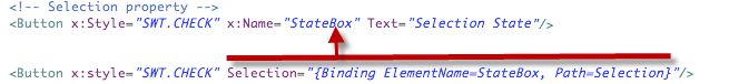
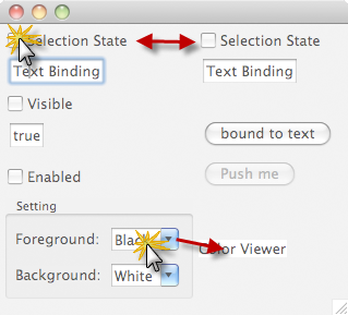
The widgets in the left column are in sync with the respective widgets in the right column.
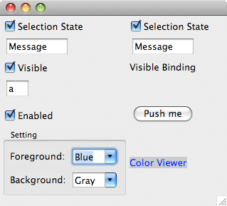
A single widget can also be bound to multiple widgets. In the above case, the text of two Combo instances is synchronized with the "background" and "foreground" of a Label. When the selection of either Combo changes, the label appearance gets updated immediately.
- View: the graphical user interface
- Controller: the agent to deal with UI events and application logic
- Data context: the type of data to show
- Meta-model service: provides the structure of mediator
Each mediator can be plugged in anywhere under the same kind of data context.
The UI Mediator wizard allows you to create a mediator from a selected class, which is used as the data context.
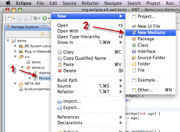
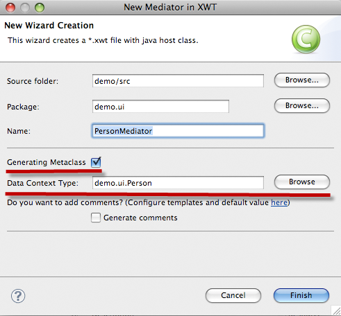
This wizard will create a mediator with three files: XML view, Java controller and Meta-model service in Java, and it will generate the default content based on the data context model.
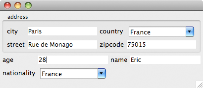
Here is an example of a person object with attributes: name, age, nationality and a reference address.
Each UI loader must implement the interface IXWTLoader, and the class XWTLoaderManager is used to activate or deactivate an XWT Loader.
Control binding has been extended to support JFace viewers as a data binding source. This enables declarative JFace event handling to synchronize with other UI's state.
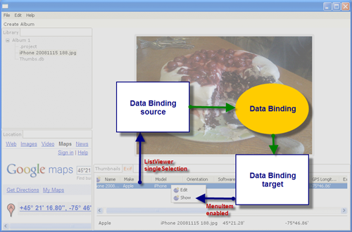
For example, in the XWT version of the e4 photo demo, MenuItem's property "enable" is bound with the selected item "singleSelection" in a ListViewer.
- http://www.eclipse.org/xwt
- http://www.eclipse.org/xwt/presentation
- Namespaces prefixed by "clr-namepsace:"
All other namespaces are considered as external namespaces and ignored by default.
XWT includes an extensibility mechanism to handle external namespaces. In particular, an INamespaceHandler must be registered via XWT for each external namespace class beforehand:
XWT.registerNamspaceHandler(String namepsace, INamespaceHandler handler);
The handler is called when the XWT loader reaches an attribute declared in the external namespace.
This solution can be considered as an annotation, which is used to associate user-defined information with XWT elements.
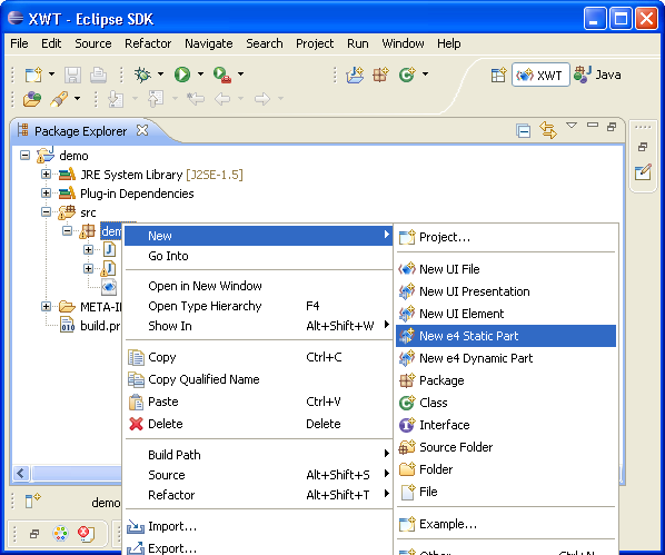
Two wizards are available in org.eclipse.e4.xwt.tools.ui to create e4 view parts:
- New e4 Static View Part
- New e4 Dynamic View Part
The static view part wizard is used to create a part whose content is described in an XWT resource file, which can be either local or remote. The dynamic view part wizard is designed to create a UI at runtime via a Java class.
The static view part should be a subclass of XWTStaticPart, which manages the communication between the e4 workbench and XWT.
XWT supports specification of a converter inside the binding expression, which can be used only for a single binding.
The data binding can be expressed in extension markup language in an attribute value:
<Label text="{Binding Path=name, converter=y:MyConverter}"
or in pure XML:
  <Label
    <Label.text>
      <Binding path="name">
        <Binding.converter>
           <y:MyConverter/>
        </Binding.converter>
      </Binding>
    </Label.text>
  </Label>
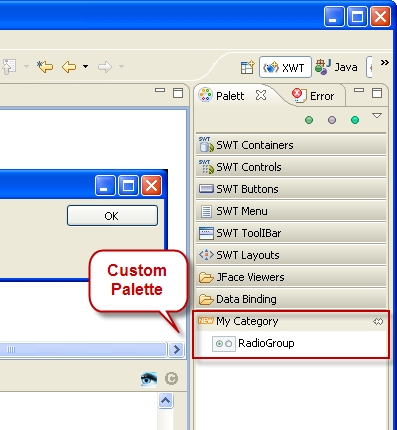
You can extend the tool palette of the XWT UI editor via an Eclipse extension point. The following extension defines a custom catagory "My Category" with a tool named RadioGroup. The attribute content contains a text block, which is used to insert in XML code when we drag and drop the tool in XML editor. The content's value may contain template variables since the Eclipse template engine is used during the insertion.
<extension
point="org.eclipse.e4.xwt.vex.customPalette">
<category
icon="icons/new.png"
name="My Category">
<tool
content="<RadioGroup x:style="SWT.NONE"><RadioGroup.layout>
<GridLayout numColumns="1"
/></RadioGroup.layout></RadioGroup>"
icon="icons/radiogroup.png"
name="RadioGroup">
</tool>
</category>
</extension>
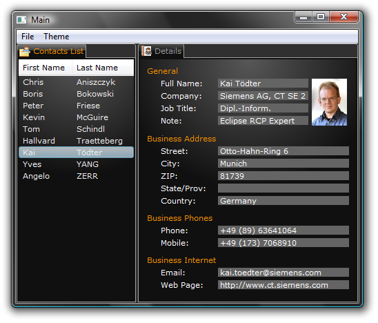
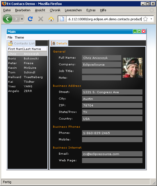
The e4 Contacts demo is used as an example of the integration of XWT in the e4 workbench. Two view parts "Contacts List" and "Details" are developed in XWT with the CSS support.
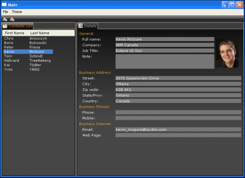
The source can be found in Bug 279047
This example illustrates the following features in XWT:
- Control/Viewer binding
- CSS integration
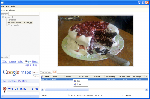
Here is the Exif view in XWT:
Below is the Exif editing dialog in XWT:
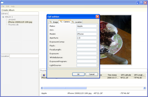
The source can be found in Bug 263720
- Debugger support
- Incremental build support
- Launch support
- Code completion for the subset of the Java class libraries used by SWT/BE
- Error reporting
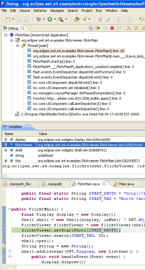
Here is the debug view. You can set breakpoints and step in Java code that is cross-compiled to ActionScript. When you step through the Java code, you are actually stepping within the Flash player. You can click on stack frames and inspect variables.
Just like on the desktop, you can concentrate on writing your Java code and let the project builder automatically build and keep your project's ActionScript code incrementally up to date.
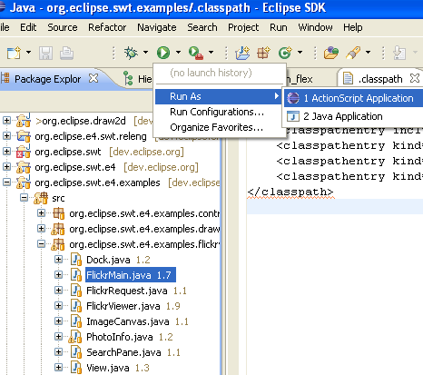
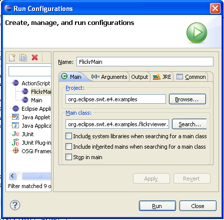
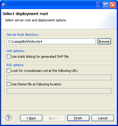
You can configure, run and debug your application using the integrated launch support. The launch support allows for both static and dynamic linking of ActionScript code in the generated SWF files. SWFs are automatically deployed to a local Jetty server, provided by the launch support.
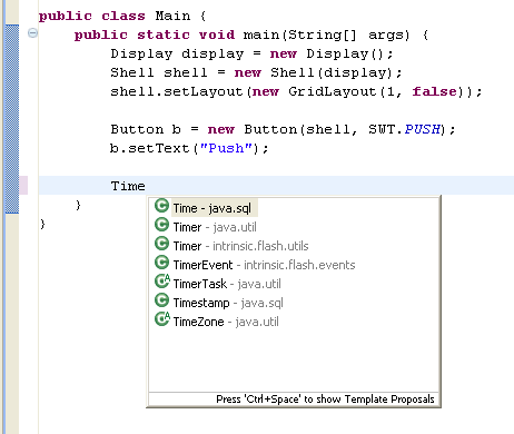
When you type, code completion is provided against the subset of the Java class libraries that ship with SWT/BE. This means that you will not reference classes or methods that do not exist in the subset.
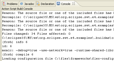
For debugging purposes, you can monitor build progress in the ActionScript console.
Basic hello world example:
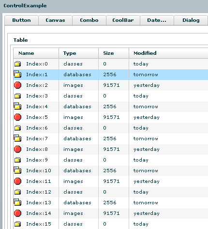
Control Example which shows all of the SWT controls:
Draw2D example which shows an app making use of the Draw2D libraries to draw some diagrams:
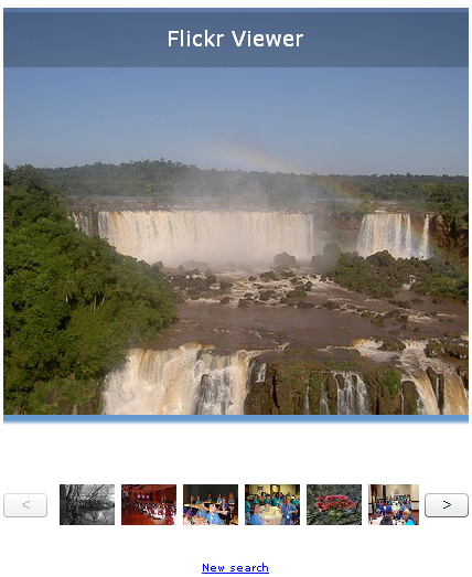
The Flickr example demonstrates how an SWT app might make use of REST services. This simple app queries and displays pictures obtained via Flickr Services.
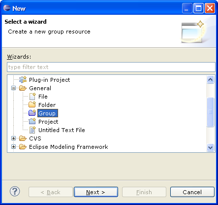
Groups are fully compatible with the existing 3.x Core Resource API, and all plugins work just as expected. Groups are seen internally by clients as a linked resource folder with a null location (IResource.getLocation() returns null).
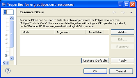
Resource filters are a powerful feature that allows an Eclipse project to include folders that contains thousands of elements, but only include a fraction of them in the project. As opposed to UI view filters, resource filters are applied at the lowest level, and do not incur any performance cost for excluded files and folders.
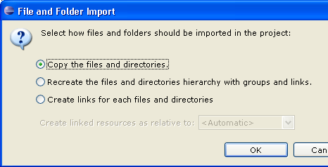
- Copy the files under the target directory (the previous operation)
- Create a hierarchy of groups and linked resources replicating the file system file and folder hierarchy
- Create only linked resources
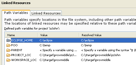
Linked resources can also be creating when dragging resources from one project to another, transparently transferring the path variables the linked resource might be referring to. See a video demonstration of creating links via drag and drop.
Note that this linked-resource drag and drop awareness is currently only available to the Navigator view.
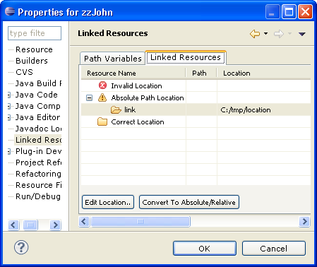
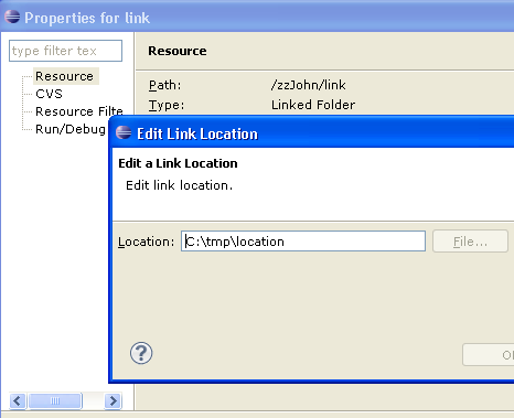
You can then easily see which linked resource requires modification, and change it directly in the dialog by choosing the Edit... button. You can also automatically convert one or many linked resources to absolute or relative paths by clicking on the Convert To Relative/Absolute button. This command will automatically generate linked resources if needed and try to make the path as portable as possible.