Platform Changes |
| New look for the workbench |
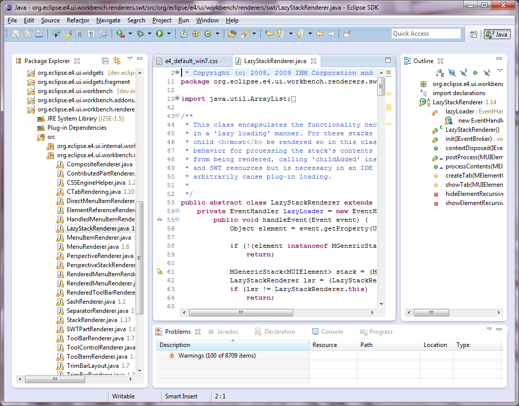
The default appearance of the platform user interface has been refreshed. The main
goals of this update were to adopt a more modern visual style, reduce clutter, and
use whitespace rather than extra keylines to separate user interface elements. Tabs
and part stacks have been redesigned to reduce emphasis on non-selected tabs and stacks.
|
| Global search bar |
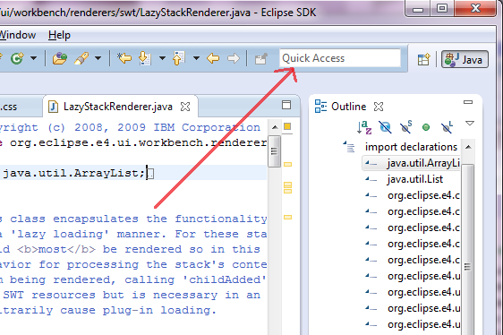
The workbench now has a global search field in the tool bar. This provides a visible
affordance for the "Quick Access" feature, and may be used in the future to
combine other kinds of searches into a single location.
|
| More flexible part layout |
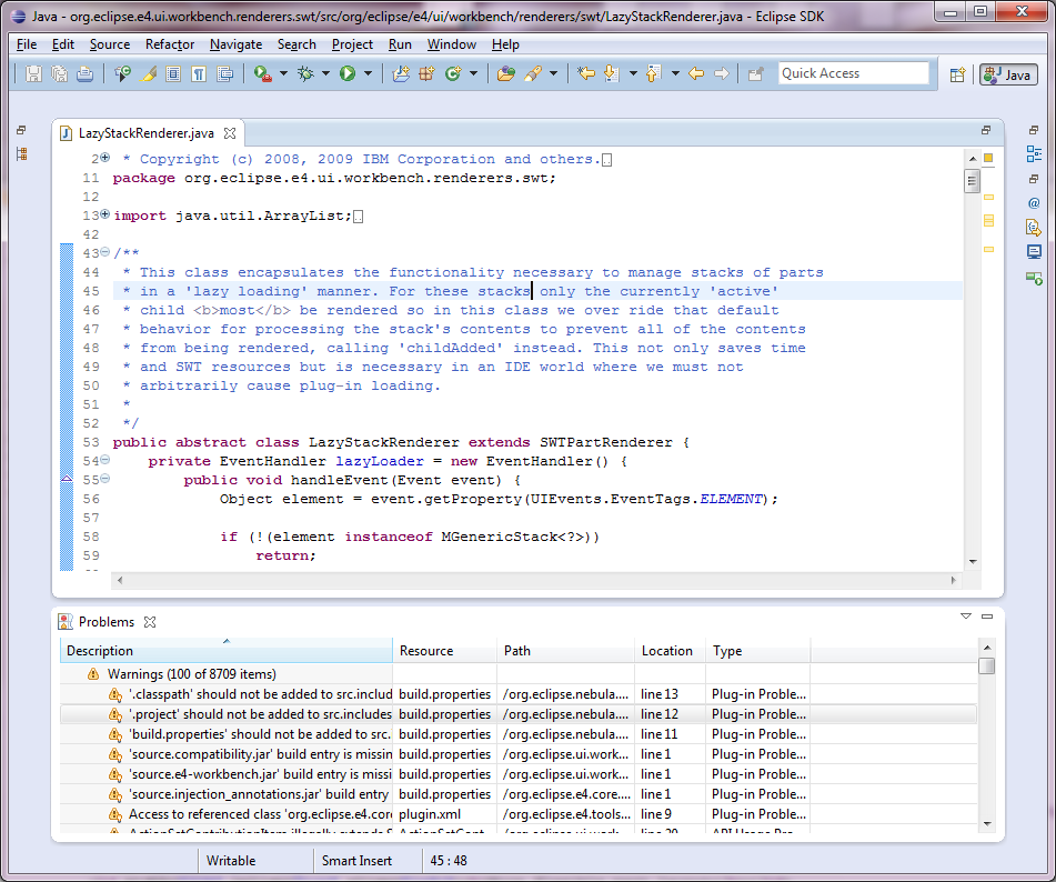
You can now stack views and editors together by default. For example a view
that requires a large working area can be stacked in the editor area to provide more space.
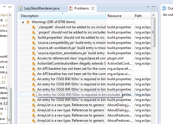
Not only can you mix views and editors, but you can split the editor area to put a view
beside an editor in the editor area, and then maximize the entire editor area to work with both at the same time.
|
| Editor area |
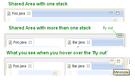
A specialized container has been introduced to allow
the UI to properly represent the editor area. This affordance lets the user know that this
area behaves differently - for example the entire area can be maximized, and all views and
editors within the area will be affected.
You will not see any 'area' indication if there is only a single stack there. If there is more
than one stack in the shared area, you see the area's boundary, with a 'fly out' hover area
that will show the minimize/maximize buttons.
|
| Detached editors |
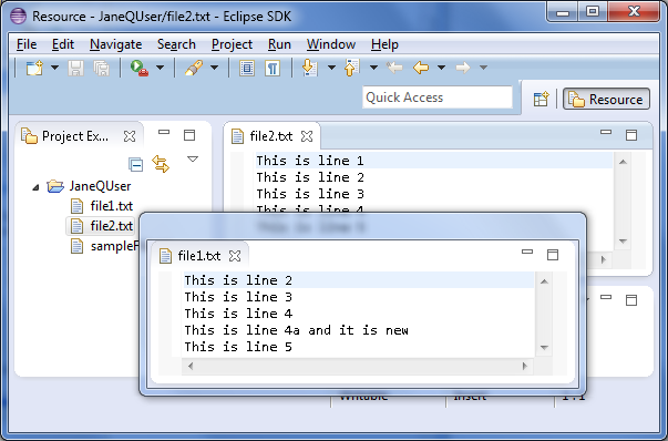
Editors can now be detached into their own windows. The detached
editor will not be treated any differently from an editor
contained within the workbench window. This resolves
bug 8886,
one of the platform's oldest and most voted for enhancements.
|
| Multi-drag sash |
You can now place the cursor at the intersection of two or more sashes and
drag them all at the same time. When you are going to be dragging multiple sashes, the cursor
will change to one with 4-way arrows. The image below indicates one such
intersection with a red circle.
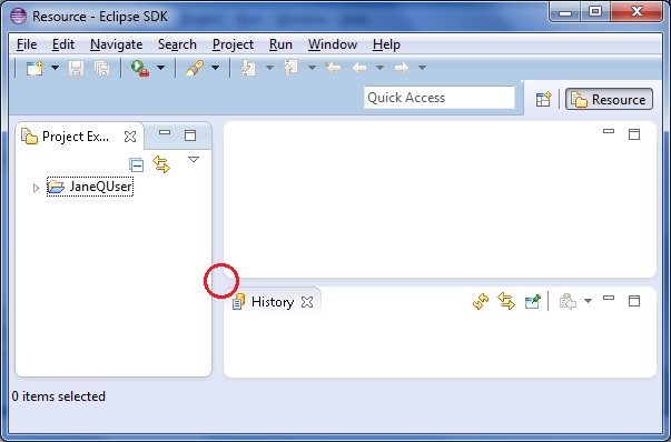
|
| Fade transition on maximize |
A 'fade' effect has been added to the maximize / restore operation. You can turn the fade
effect off using the animations preference, found under Window > Preferences > General > Appearance
(see a video).
|
| New high resolution icon |
The Eclipse SDK now has a shiny new icon. The icon is now in high resolution, making
for a much more polished appearance on modern operating systems.

|
| Open Resource dialog supports Show In |
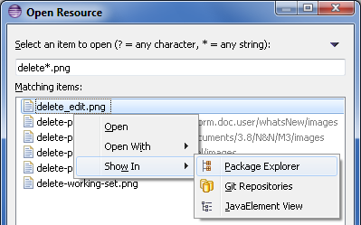
The Open Resource dialog (Ctrl+Shift+R) has a new Show In > ... context menu item that
allows to show selected resources in a view instead of opening them in an editor.

|
| Delete project dialog shows project location |
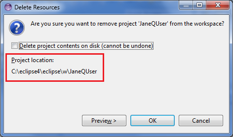
The Delete Resources dialog now shows the location of projects to be deleted on the file system:

|
| Editor area tab navigation |
Navigation arrows have been introduced to the sides of the editor area to allow
you to click and view the tabs that are to the left and right of the currently
selected tab. This is the default setting on new installations. Switching to the
Classic theme from the preferences (Preferences > General > Appearance)
will allow you to bring back the MRU behaviour from 3.x. The MRU behaviour can
also be toggled on and off via CSS by setting the mru-visible attribute
of an MPartStack to true or false.

|
| Lightweight refresh enabled by default |
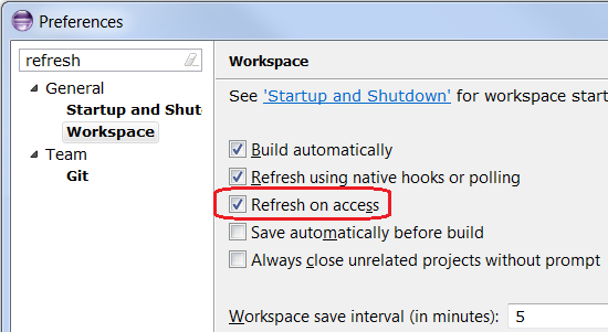
In Eclipse 3.7 a new lightweight refresh mechanism was introduced. Files discovered to be out-of-sync
by the workspace, for example while accessing the file content by an editor,
are automatically asynchronously refreshed. In Eclipse 3.7 and 3.8 you have to enable this yourself
via Preferences > General > Workspace and select Refresh on access.
In Eclipse SDK 4.2 the mechanism is enabled by default.

|
| Support for MacOS X Full Screen |
A new Window > Toggle Full Screen command is now supported on MacOS X Lion.
|
| Ant updated to 1.8.3 |
The bundled version of Apache Ant in the platform has been updated to version 1.8.3.
For more information on what is new in Ant 1.8.3 please see the Apache Ant release notes.
|
| Enhanced Editor Support for Ant 1.8.2 |
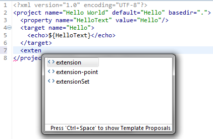
The Ant editor has been enhanced with support for the new extension-point
features in Ant 1.8.2.

|
| Add all known buildfile types to Ant view |
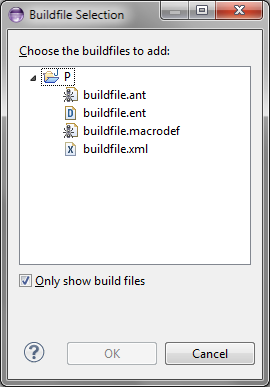
The Buildfile Selection dialog for the Ant view has been updated to allow filtering
for all known kinds of build files rather than just *.xml and build.xml.

|
Editor Changes |
| Use saturated colors in overview ruler |
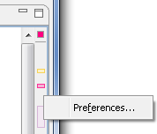
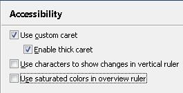
The new Use saturated colors in overview ruler preference allows to show the annotations in the Overview ruler using saturated colors:


This option is turned off by default and can be enabled on the General > Editors > Text Editors > Accessibility
page.
|
Team/CVS Changes |
| Filters in CVS Sync View |
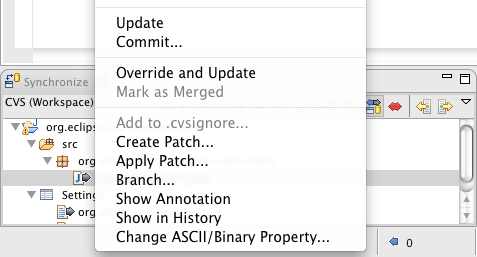
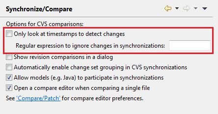
You can now use regular expressions to filter out changes in the CVS Synchronize view.
To enable filters go to Preferences > General > Team > CVS > Synchronize/Compare,
uncheck Only look at timestamps to detect changes and enter your regex pattern
in the Regular expression to ignore changes in synchronizations field. Each difference
in a change is checked against the pattern and is considered as matched, if either left or right side
of the difference matches. If all diffs in a file match, the file is excluded from the view.

|
Debug Changes |
| Global debug toolbar |
To improve the presentation of the Debug perspective, the common debug control commands
(Stop, Resume, etc.) have been moved out of the Debug view and into the global toolbar.

The global toolbar can be customized with the Window > Customize Perspective... action to add or
remove debugging commands, or to show/hide the debug toolbar completely.
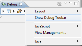
Old toolbar behavior can be restored by first toggling the Show Debug Toolbar option in the Debug
view's menu, then by disabling the Debug toolbar from the Customize Perspective dialog.

|
| Improved editing of environment variables |
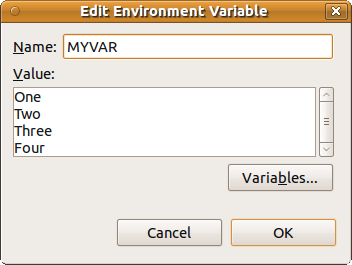
Editing multi-line environment variables is now much simpler with a new UI that presents the variables in a scrolling text widget.
The new UI can be found in the edit dialog for a multi-line environment variable on the Environment tab of a supporting launch configuration.

|
| Improved launch configuration name validation |
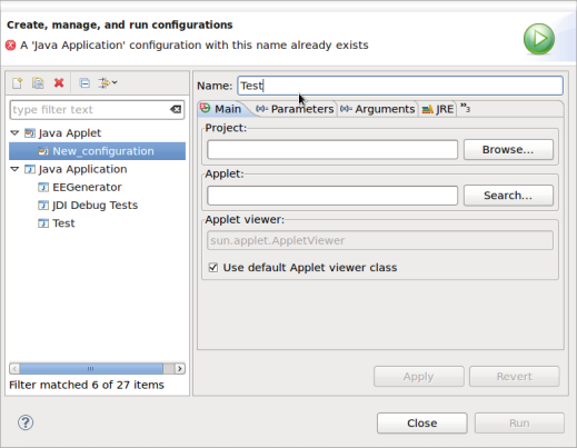
Now if you create a launch configuration with the name of an existing configuration, the type of the conflicting configuration
is noted in the error message.

|
| Debug tracing |
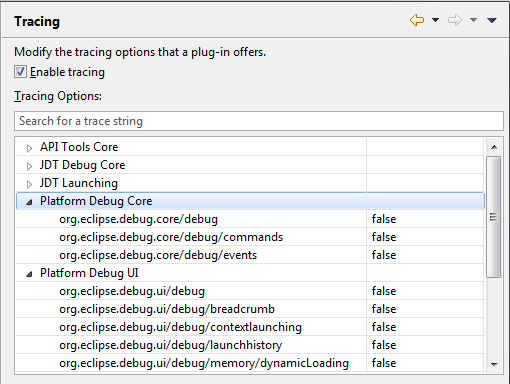
JDT and Platform Debug have added all debug tracing settings to the Tracing preference page where they can be enabled and disabled as needed without restarting.

|
| Breakpoint view sorting |
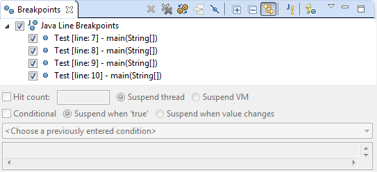
The Breakpoints view now has improved sorting that will take into account any line
numbers that appear in the label and sort accordingly.

|


![]()
