This article describes the theming of RWT, the RAP Widget Toolkit. This theming defines the default look and feel of the RWT widgets. It is not related to Eclipse workbench concepts like the workbench theming or custom stack presentations. Instead, it resembles the theming capabilities commonly provided by desktop systems that allow users to set their custom colors for window title bars, custom fonts, and the like.
The theming controls various aspects of the widget's appearance such as
colors, fonts, and borders.
Even advanced effects as gradients and animations are supported.
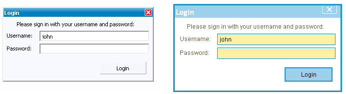
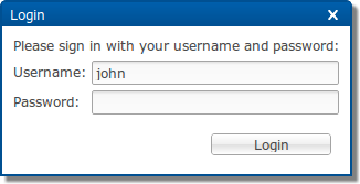
As an example, the following screenshots show the same dialog with the
default theme and with a custom theme.
As you can see, a custom theme does not only alter some colors, it also
affects the size of widgets by changing dimension properties like paddings,
borders, and font sizes.
RWT themes are being defined by CSS files that are registered with the
extension point org.eclipse.rap.ui.themes.
Existing themes can be extended by theme contributions using the same
extension point.
The CSS files are not directly passed to the client's browser, but parsed
and evaluated by RAP on the server side.
The reason for this is that RAP executes all layout calculations on the server
and thus, the server needs to know the actual sizes of borders, margins and
paddings for every widget.
After evaluating the CSS theme file, the server passes a pre-processed
version of the style definitions to the client.
Create a *.css file as explained above and place it somewhere in your project.
Since your theme probably needs image resources as well, an extra theme folder
is recommended.
Remember to include this folder in the project's build.properties
file to make them available in a deployment.
If the file contains non-ASCII characters, it has to be UTF-8 encoded.
In order to make your theme available for RAP, you have to register it with
the extension point org.eclipse.rap.ui.themes.
In the plugin.xml of your application project, add an extension
like this:
  <extension
      point="org.eclipse.rap.ui.themes">
    <theme
        id="my.application.aquablue"
        name="Aqua Blue Test Theme"
        file="theme/aquablue.css" />
  </extension>
Now your theme is registered, but your application still doesn't use it.
To make your application use the custom theme you have to register a branding.
In short, a branding binds several settings (including the theme to use) to a
servlet name.
For more details, refer to the article on
RAP Branding.
For example, the following extension makes the application available at
the URL http://hostname:port/aqua
  <extension
      point="org.eclipse.rap.ui.branding">
    <branding
        id="my.application.aquabranding"
        servletName="aqua"
        defaultEntrypointId="my.application.entrypoint1"
        themeId="my.application.aquablue">
    </branding>
  </extension>
Create a *.css file that extends an existing theme.
The theme file can be placed anywhere in your project.
The extension theme file can also refer to images kept in the project.
Don't forget to include everything in the project's
build.properties file.
If the file contains non-ASCII characters, it has to be UTF-8 encoded.
Register the contribution with the extension point
org.eclipse.rap.ui.themes, using a themeContribution
element.
In the plugin.xml of your application project, the extension
will look like this:
  <extension
      point="org.eclipse.rap.ui.themes">
    <themeContribution
        themeId="my.application.aquablue"
        file="aqua-extensions.css" />
  </extension>
Now your theme contribution is registered and will automatically added to the existing theme.
Note that many contributions can be added to a theme and the order in which those contributions are appended is undefined. Therefore, you should only add rules to the extension CSS file that will not be overridden by other contributions. As an example, rules for custom variants (see below) that are defined in the same plug-in will be safe as long as other theme contributions do not reference the same variants.
The theme files for RAP are written in CSS using widget types as element
names.
The syntax must be valid
CSS 2.1,
although RAP does not support the complete CSS syntax.
Some advanced concepts like "@"-rules and certain selector types are
not supported.
This section explains the basic rules for writing CSS theme files.
The CSS file contained in the demo project
(org.eclipse.rap.demo) can serve as a more complex example.
A CSS file is simply a sequence of style rules. A style rule is a selector or a comma separated selector list, followed by a block of declarations enclosed in braces. Declarations start with a property name, followed by a colon, followed by a value and end with a semicolon. The following is an example of a simple theme file, consisting of two style rules:
  Button[PUSH], Button[TOGGLE] {
    border: 2px solid blue;
    color: rgb( 17, 23, 103 );
    background-color: #f9f9f9;
  }

  Button[PUSH]:hover, Button[TOGGLE]:hover {
    background-color: white;
  }
A selector defines to which widgets or components of a widget a rule applies.
Selectors can refer to SWT style flags and also to certain widget states.
The element names to be used are either simple widget type names,
such as Button and Table, or names of sub-components
of a widget like ProgressBar-Indicator.
A complete list of themeable widgets and their element names can be found in
the theming reference.
Certain SWT style flags can be referred to in CSS selectors to allow to define a styling depending on the widget type. For style flags, the attribute syntax from CSS must be used:
  Button[BORDER] {
    ...
  }
In addition to style flags, which do not change during a widget's lifetime, there are also dynamic widget states a theme can refer to. To do so, use the CSS attribute syntax:
  Button:hover {
    ...
  }
SWT.PUSH
and SWT.BORDER and are currently
in state hover:
  Button[PUSH][BORDER]:hover {
    ...
  }
The styles and states that a theme can refer to depend on the widget and are also listed in the theming reference.
Normally, a theme setting affects all widgets of a given type equally. By defining widget variants it is possible to apply an individual presentation to particular widgets without affecting all widgets of that type. As an example, imagine an application that uses buttons in a special banner bar. These buttons should have a different font and text color than normal buttons. By making these buttons part of a variant (e.g. "mybutton"), you can define separate CSS rules for these widgets.
To implement this, the buttons in the banner bar are marked as belonging to a custom variant (e.g. "mybutton") in the Java code using SWT widget data:
button.setData( WidgetUtil.CUSTOM_VARIANT, "mybutton" );
In the theme CSS file, these widget variants can be referred to using the class notation known from CSS used for HTML:
  Button.mybutton {
    ...
  }
The themeable properties are also widget specific. Not all RWT widgets are equally customizable, some already provide a large set of themeable properties, others are still more hard-wired. An overview of all available elements and their themeable CSS properties can be found in the theming reference. As well as the properties itself, also the syntax for the property values is a subset from CSS. It is also documented in the reference.
If more than one rule applies to a given element, property values defined in one rule can overwrite those in another rule. The precedence of rules and properties is defined in the CSS specification. In short, it is defined by the specificity of a rule and its position in the CSS file. Please refer to the CSS specification for a detailed description.
The SWT classes Display and Device contain methods that return default system colors, a system font, and system images. In RAP, these defaults are also controlled by the theme. For details, see the theme reference of the Display element.